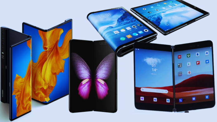
Folding devices such as the Samsung Galaxy Fold and Huawei Mate X mark an exciting new horizon in mobile technology. As these Phone become more prevalent, the issue of building applications designed for their configurations will arise. While you can go by the length and breadth of a comprehensive mobile app development guide, here we specifically take you through the journey of mobile apps for foldable Phones to ensure the best user experience.
This guide covers design principles, particular programming practices, and testing techniques for these devices. Capture the progressive mobile technology environment and gain valuable insights to help businesses succeed in the foldable smartphone age.
Crafting Seamless and Innovative Apps for Foldable Phones
Understanding the hardware
The major distinguishing feature of foldable Phones is their capacity to transform from a phone into a tablet. This is achieved through a flexible display that can be folded in half. Unfolded, the inside display offers a larger canvas for the apps. Most foldable phones also have the additional feature of an outer display that is relatively smaller and is used to carry out minor tasks such as checking notifications.
It’s important to understand the specifics of the foldable hardware:
- Screen sizes – The interior screen on Phones like the Galaxy Flip measures 7.3 inches diagonally. The exterior screen is much smaller, around 4.6 inches.
- Screen ratio – Foldable displays are quite rectangular, with an aspect ratio of around 4:3 or 5:4. This is closer to a tablet than a traditional phone.
- Seam – There is a visible seam where the display folds. It’s important to avoid placing critical UI elements near this crease.
- Dimensions – When folded, the device is quite narrow, so it can still be used one-handed. But unfolded dimensions are closer to a small tablet.
Knowing these hardware details will allow you to optimize the app experience.
Adapting layouts and interfaces
The most immediate challenge is adapting app layouts and interfaces to work well across the different screen sizes. Here are some tips:
- Use flexible layouts – ConstraintLayout, RelativeLayout, and other fluid layouts are essential to handle large and small screens gracefully.
- Optimize for landscape – Most usage in the unfolded state will be in landscape orientation. Make sure the layout works well sideways.
- Avoid fixed sizes – Use dimension resources and constraints instead of pixel sizes. This allows UI elements to resize appropriately.
- Reflow text – Ensure text sizes and line lengths adjust based on the available space. Consider using lower text density on the expanded display.
- Simplify interfaces – Reduce UI clutter on the smaller exterior display to highlight only the most important elements.
- Customize navigation – Adjust side menus, navigation drawers, and other navigation patterns for each display size.
There are popular mobile app development frameworks such as React Native, Flutter, Xamarin, or NativeScript to help you build quality solutions. Further, you can customize them to create adaptive interfaces adapted for both the folded and unfolded states. The special cross-platform frameworks have features such as adaptive layouts, dynamic text sizing, and runtime configuration, enabling effortless adaptation for foldable screens. Moreover, platform-dependent APIs to control the state of activity and enhance performance will allow you to address the challenges of foldable Phones.
Enhancing layouts for the seam
The seam on foldable Phones requires some special layout considerations. You’ll want to avoid having it intersect with important UI components. There are a few techniques to handle the seam:
- Adapt margins – Increase your layouts’ blank spaces and margins around the seam area. This avoids overlap.
- Limit width spans – Reduce the maximum width of layout spans so they don’t cross the seam.
- Shift or hide elements – You can programmatically shift elements away from the crease or hide them when spanned.
- Darken seam – Where possible, visually downplay the seam by darkening or blacking out the pixels around it.
- Custom fold animations – As the Phone folds and unfolds, add custom animations to transition UI elements gracefully.
With seam optimizations, you can deliver fluid, continuous experiences.
Planning state management
Users will transition their foldable Phones between opened and closed states throughout the day. You must carefully consider maintaining a continuous user experience between these states. Here are some tips:
- Retain activities – Configure your activities to retain their state as the device folds and unfolds.
- Asynchronous saving – Save work and user data continuously and asynchronously to handle state changes gracefully.
- Perspective preservation – When reopening an app, restore the previous perspective and viewer position as closely as possible.
- Seamless handoffs – Transfer any required data across the seam between the small and large screens as needed.
- Consistent pairing – Make sure a foldable app on the exterior screen is paired contextually with its counterpart on the interior surface.
With robust state management, you can enable seamless user workflows as the Phone folds open and closed.
Optimizing foldable app performance
The multitasking capabilities enabled by foldable Phones introduce performance considerations. Users will expect to run multiple apps simultaneously across the various screens. To optimize for this:
- Benchmark thoroughly – Test performance rigorously on real foldable Phones. The larger screens require rendering more objects and views.
- Improve caching – With more app data in memory, effective caching is key to fast performance. Review your caching strategy.
- Assess libraries – Third-party libraries may not be optimized for foldable environments. Test them thoroughly before integration.
- Minimize battery usage – Use performance best practices to reduce processor and battery demands. This enables better multitasking.
- Review threading – Evaluate places where additional threading could speed things up by using multi-core processors.
Proactively optimizing performance can deliver snappy experiences even with simultaneous app usage.
Considering new patterns and paradigms
Foldable Phones enable new usage paradigms not possible with traditional smartphones. Take time to brainstorm innovative features and interfaces tailored to these devices:
- Dual app views – Display master-detail, primary-secondary, or overview-detail views across the two screens.
- Expanded canvases – Enable new creation workflows leveraging the large interior surface area.
- Cross-screen experiences – Design compelling experiences that transition seamlessly from the small exterior to the large interior display.
- Desktop-like multitasking – Let users run separate apps simultaneously on each display for desktop-like multitasking.
- Adaptive watch modes – For wearables with foldable displays, adapt experiences for expanded wrist real time.
By embracing the possibilities, you can provide users with new interactive and multitasking experiences native to foldable Phones.
Testing your Apps for Foldable Phone
Testing your apps on real foldable Phones is ideal. However, these Phones are likely to be scarce during development. So you’ll want to set up an effective mix of test environments:

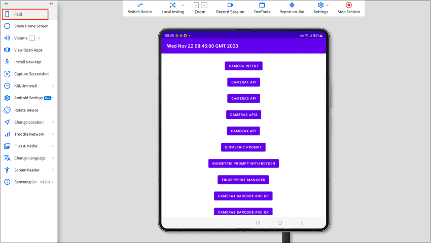
- Emulator folding – Use Android Studio’s foldable emulator to simulate different folding states during development.
- Manual testing – Do any manual testing on real foldable Phones you can access. Sign up for device access programs.
- User labs – Conduct in-person user testing in labs to observe how people interact with your app on foldable Phones.
- Remote testing – Use services like TestFlight and Google Play to distribute test builds to beta testers with foldable Phones.
- Stress testing – Rigorously test screen rotations, state transitions, layout changes, and seam transitions.
You can deliver a polished user experience for foldable mobile Phones with emulators, real devices, and beta tests.
Also Read – Why Apple is Slowly Moving into the Gaming Industry?
The future of foldable apps
The emergence of foldable phones marks the initial phase of a broader trend extending to tablets, laptops, wearables, and beyond. Applications that embrace these advancements in display technology are poised to deliver unprecedented user experiences, unlocking possibilities previously constrained by rigid, flat screens.
In the coming age of foldable Phones, advanced mobile app development companies are the pioneers in innovation because, with the skills to use foldable app patterns, such companies demonstrate the potential to create revolutionary experiences on bendable displays.
All in all, search and get mobile app development companies that provide highly customized solutions and enable a smooth transition into the era of foldable technology appropriate for businesses that want to take advantage of foldable Phones and embrace this transformative trend.
Discover Useful Free Tools Relevant to This Article
Below are some helpful, free web tools that can support your projects and tasks relevant to the ideas and tips shared in this article. These tools are designed to make your work easier and more efficient for free:


